# ftw-serverside-collection
The ftw-serverside-collection component is used to display data fetched, filtered and sorted by the backend.
On small screens ($vuetify.breakpoint.smAndDown), the data is displayed as list items, otherwise as a customized data table.
WARNING
This component requires debounce-async. Make sure to install it in order to use this component:
yarn add debounce-async
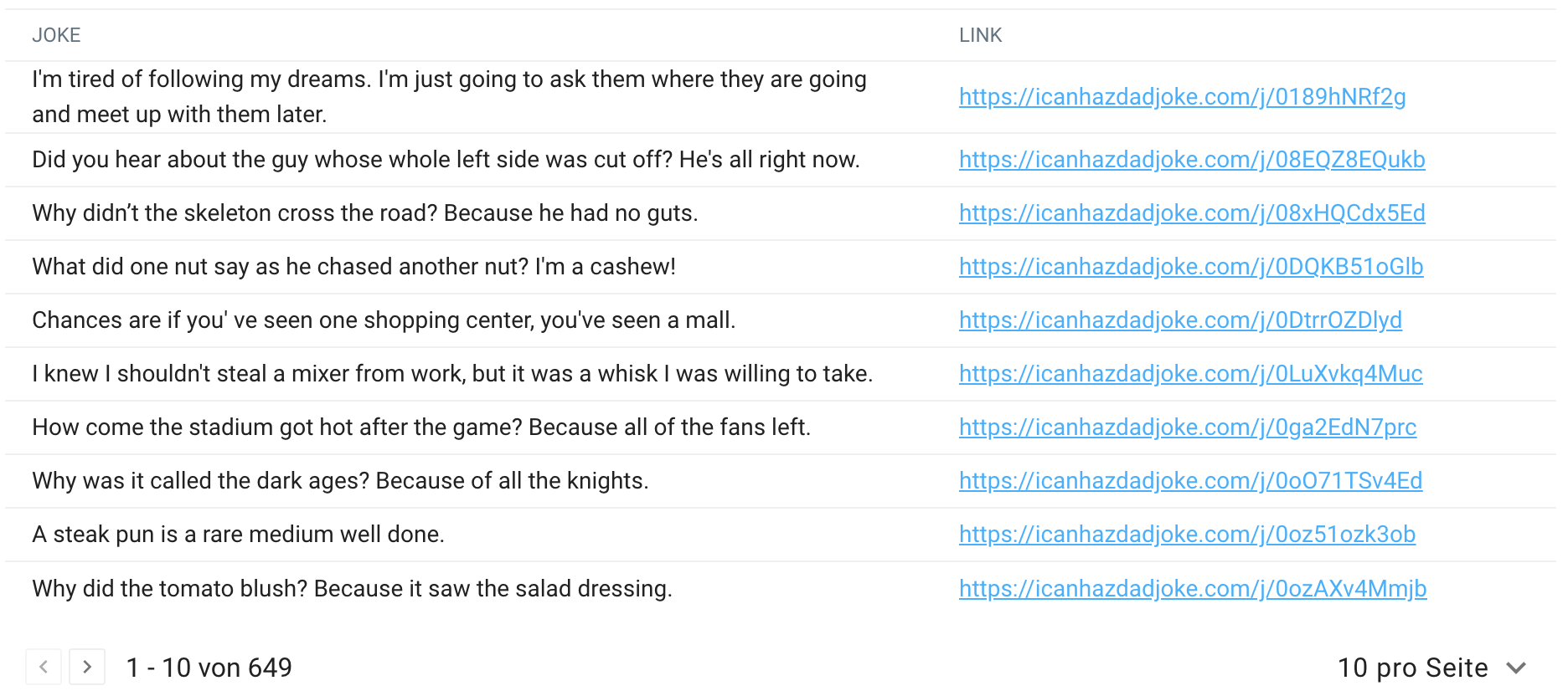
Serverside Table:

Serverside Custom Table (alternative layout):

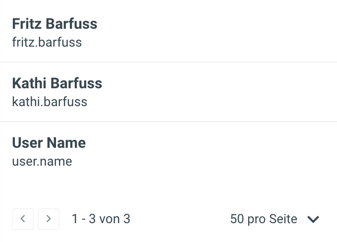
Serverside Listing:

# Usage
<template>
  <div>
    <ftw-serverside-collection :fetch="loadData" :headers="headers" />
  </div>
</template>

<script>
export default {
  data() {
    return {
      headers: [
        { text: 'One column', value: 'column_one' },
        { text: 'Other column', value: 'column_two' },
      ],
    }
  },
  methods: {
    loadData(filter) {
      return this.$http.$get('/api/endpoint/', { searchParams: filter })
    },
  },
}
</script>
# Example
The following example fetches data from an external API endpoint and displays it. Note that this example does not apply any filter, see below for an example with a filter.
<template>
  <ServersideCollection
    :fetch="loadData"
    :headers="headers"
    :items-per-page-options="[10, 20, 30]"
    :items-per-page-default="10"
    count-property="total_jokes"
    page-size-param="limit"
  >
    <template #title="{ item: { joke } }">
      {{ joke }}
    </template>
    <template #item.id="{ item: { id } }">
      <a :href="`https://icanhazdadjoke.com/j/${id}`" target="_blank">
        {{ `https://icanhazdadjoke.com/j/${id}` }}
      </a>
    </template>
    <template #item="{ item }">
      <v-list-item>
        <v-list-item-content>
          <v-list-item-title>
            <strong>{{ item.joke }}</strong>
          </v-list-item-title>
          <v-list-item-subtitle>
            <a :href="`https://icanhazdadjoke.com/j/${item.id}`" target="_blank">
              {{ `https://icanhazdadjoke.com/j/${item.id}` }}
            </a>
          </v-list-item-subtitle>
        </v-list-item-content>
      </v-list-item>
    </template>
  </ServersideCollection>
</template>

<script>
export default {
  data() {
    return {
      headers: [{ text: 'Link', value: 'id', sortable: false }],
    }
  },
  methods: {
    loadData(filter) {
      return this.$http.$get('https://icanhazdadjoke.com/search', {
        headers: { Accept: 'application/json' },
        searchParams: filter,
      })
    },
  },
}
</script>
# Filtering and sorting
A filter can be defined and modified outside component. If it changes, the component fetches the data again. This works well with the component <ftw-text-filter-field> for example.
Similarly, the ordering parameter can be part of the filter. One may use the component <ftw-ordering-menu> for this.
The ordering parameter is automatically updated for sortable columns for the CustomTable style. The ordering is thereby a list of columns being sorted. The sorting direction is identified by a - for descending and no prefix for ascending. This schema is heavily inspired by https://www.django-rest-framework.org/api-guide/filtering/#orderingfilter.
<template>
  <div>
    <v-container fluid class="mb-2 d-flex">
      <ftw-text-filter-field v-model="userFilter.text" class="shrink" />
      <v-spacer />
      <ftw-ordering-menu v-model="userFilter.ordering" :items="userOrderingOptions" />
    </v-container>
    <ftw-serverside-collection :fetch="loadUsers" :headers="headers" :filter="userFilter">
      <template #item="{ item }">
        <v-list-item>
          <v-list-item-content>
            <v-list-item-title>
              <strong>{{ item.full_name }}</strong>
            </v-list-item-title>
            <v-list-item-subtitle>
              {{ item.username }}
            </v-list-item-subtitle>
          </v-list-item-content>
        </v-list-item>
      </template>
    </ftw-serverside-collection>
  </div>
</template>

<script>
import { fromQueryString } from '@4tw/ui/lib/util/query'

export default {
  data() {
    return {
      headers: [
        { text: 'Name', value: 'full_name', sortable: false },
        { text: 'Username', value: 'username', sortable: false },
      ],
      userFilter: fromQueryString(this.$route.query, ['text', 'ordering'], {
        text: '',
        ordering: 'last_name,first_name',
      }),
      userOrderingOptions: [
        { text: 'Name (A-Z)', value: 'last_name,first_name' },
        { text: 'Name (Z-A)', value: '-last_name,-first_name' },
      ],
    }
  },
  methods: {
    loadUsers(filter) {
      return this.$http.$get('/auth/users/', { searchParams: filter })
    },
  },
}
</script>
# Props
| Name | Type | Default | Description |
|---|---|---|---|
| fetch | Function | (filter) => ({}) | A function to fetch the data, e.g. from the backend. |
| filter | Object | {} | The filter object passed to the fetch function, e.g. from the backend. |
| loading | Boolean | false | Externally set the loading state of the component. |
| disablePagination | Boolean | false | Set this to true to hide the footer showing the pagination actions. |
| itemsPerPageOptions | Array | [50, 100, 200] | Populates the dropdown to select number of items shown at once. |
| itemsPerPageDefault | Number | 50 | The default number of items shown at once when creating the component. |
| countProperty | String | 'count' | The property of the data (as returned by the fetch function) containing the total number of elements available.A dotted path notation can be used, e.g. meta.pagination.total_count. |
| itemsProperty | String | 'results' | The property of the data (as returned by the fetch function) containing the list of items.A dotted path notation can be used. |
| pageSizeParam | String | 'pageSize' | The query parameter expected by the backend to set the number of elements returned at once. |
| pageParam | String | 'page' | The query parameter expected by the backend used for the pagination control. |
| tableStyle | String | 'table' | Change the table layout. Available values are ['table', 'custom-table'] |
| value | Array | [] | Used for controlling selected rows. |
| draggableHeaders | Boolean | false | Enable rearranging headers feature. |
The component passes all props to its child components, e.g. it passes the headers property to the underlying <v-data-table>.
# Events
| Name | Description |
|---|---|
| update:loading | Emits the loading state of the component. |
| update:options | Emits the options state for the underlying v-data-table component. You can use this to change the sorting when a header is clicked. |
| input | Emits an array of selected items when the selection is changed. |
| item-selected | Event emitted when an item is selected or deselected by emitting the item and its selection state. |
| current-items | Emits the items provided via the items prop, every time the internal computedItems is changed. |
| update:headers | Emits headers after they have been rearranged. |
# Slots
| Name | Description |
|---|---|
item | Slot to set the layout used for the listing representation displayed on small screens. |
title | Slot used to render a title at the top of each table row. |
select-all-warning | Slot used to render a warning, informing users, that not all items on every page have been selected. |
Additionally, the component passes all slots to its child components, e.g. the slot item.<name> can be used to customize a specific column.
# Functions
To access the functions a ref needs to be defined on the table (i.e. ref="tableName") and the functions are
called like: this.$ref.tableName.function()
| Name | Description |
|---|---|
update | Updates the data in the table |