# ftw-color-picker
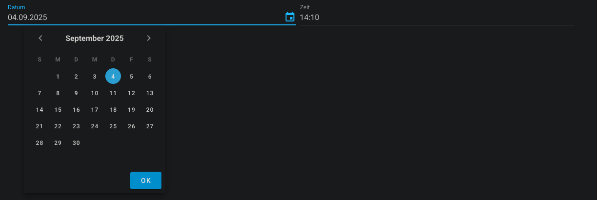
The ftw-date-time-field component is an ui component that combines a date and a time picker into one.
# Usage
<template>
  <ftw-date-time-field v-model="datetime" />
</template>
# Example
<template>
  <ftw-date-time-field v-model="datetime" />
</template>
<script>
export default {
  data() {
    return {
      datetime: null,
    }
  },
}
</script>
# Props
| Name | Description |
|---|---|
| alignToBefore | If the value should be at least a specific value to be valid. |
| before | The minimum valid value. |
| clearable | If the input should be clearable. |
| dateLabel | Displayed label for the date field. |
| disabled | If the input should be disabled. |
| timeLabel | Displayed label for the time field. |
| title | Displayed title for the entire field. |
| value | The value to be filled. |
# Events
| Name | Description |
|---|---|
| input | Emits the value when it has been changed |