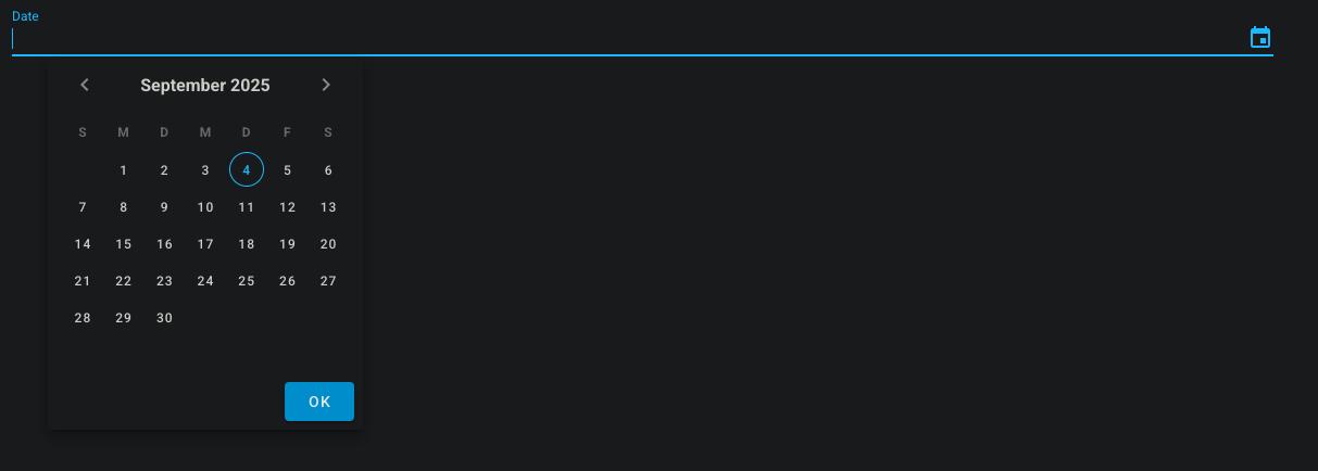
# ftw-calendar-field
The ftw-calendar-field component is an out-of-the-box component for a date input field.
# Usage
<template>
  <ftw-calendar-field v-model="date" />
</template>
# Example
<template>
  <ftw-calendar-field v-model="date" label="$t(calandarField.label)" />
</template>
<script>
export default {
  data() {
    return {
      date: null,
    }
  },
}
</script>
# Props
| Name | Description |
|---|---|
| clearable | If the input is clearable. |
| closeOnChange | If the date picker should close after a change. |
| disabled | If the input should be disabled. |
| label | Displayed Label. |
| placeholder | Displayed placeholder. |
| rules | Additional input rules. |
| value | The value to be filled. |
# Events
| Name | Description |
|---|---|
| input | Emits the value when it has been changed |
← BaseModal ColorPicker →